Portrait of a Mother's Home
I was always a little hesitant to do a house portrait just because of all the detail that went along with it. The bricks! The shingles! The foliage! And straight lines. I don't care how long you've been drawing, straight lines can still be major irritants on a bad day for those of us who can be stubborn about using rulers (I am an artist, gosh darn it!). In the end I simply couldn't turn down the opportunity presented to me to branch out further from the portrait work I've been sticking to so far, even if it was a little intimidating being tasked with recreating a house for the woman who had been living in it for a decent period of her life, making it a strong possibility that she will notice any little mistake made. But I had just drawn some houses in my illustrations for Marshall the Miracle Dog (which can be purchased here or on amazon.com. Shameless plug!), so how hard can it be, right?
Luckily my first venture into the house portrait realm allowed for an easing in thanks to its ranch style layout and white siding. At least that's what I thought when I got the original photos. Turns out it provided its own set of problems. I mentioned the straight lines, right? There are a ton of those when it comes to siding, so I did have to break out the ruler on this one just to make sure that the lines stayed true to where they should be throughout the length of the whole house, which was being dictated by perspective. And white is never just white.
Speaking of color, in addition to the white the only other color that really makes its presence known is green, making a large portion of the composition rather monochromatic. Even the roof was green (though I will say a lot of grey went down first before putting the green tint on top)! With that said, I still managed to need 5 different colors of green, so hopefully the overall piece doesn't blend or become too boring to the eye due to this consistency through the majority of the composition.
Paper Used: Strathmore Premium Recycled Drawing Paper (400 Series) cut to 11x14".
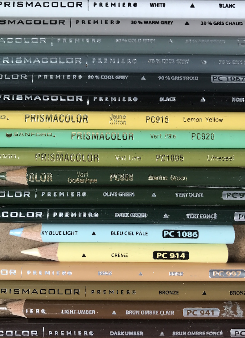
Colors Used: (Prismacolor colored pencils)
White - PC938
Warm Grey 30 - PC1052
Cool Grey 50 - PC1063
Cool Grey 70 - 1065
Cool Grey 90 - PC1067
Black - PC935
Lemon Yellow - PC915
Light Green - PC920
Limepeel - PC1005
Marine Green - PC988
Olive Green - PC911
Dark Green - 908
Sky Blue Light - PC1086
Cream - PC914
Beige - PC997
Bronze - PC1028
Light Umber - PC941
Dark Umber - PC947
Total Time Spent: 32 hours and 3 minutes
To do list: Continue to work on my technique of creating leaves, grass, shingles, bricks, etc. Extreme detail here brings about the possibility of frustration inducing bald spots, but I can't go too loose where it just looks sloppy. If there are any suggestions out there on the topic I'd love to hear them!
Until next time, Lauren H.
Follow @BewareOfTrees

